Airbus Corporate Jets needed to sell the interior of the ACJ TwoTwenty before a single unit was built. No physical cabin to walk through, no brochure that could convey the choice between 83 million possible combinations of materials, layouts, and lighting. I joined the project as UX designer at LS Group, responsible for the interaction design across three platforms: VR headset, iPad, and desktop. LS Group published a case study on it.
The problem: three platforms, one product
A configurator that works in VR doesn't automatically work on a touchscreen. Locomotion, selection, and feedback all mean something different depending on whether you're wearing a headset, holding an iPad across a table from a client, or driving a desktop demo at a trade show. The brief wasn't "build a 3D configurator." It was "make the same decision-making process feel native on three unrelated input methods."
Navigation by zone, not by menu
A jet cabin has distinct zones: galley, lounge, conference room, private suite, master bedroom. Each configurable independently, but the client needed to feel the whole cabin, not jump between disconnected screens. I built a persistent floorplan into the experience itself; at any point you could see your position in the aircraft and teleport to any zone directly.
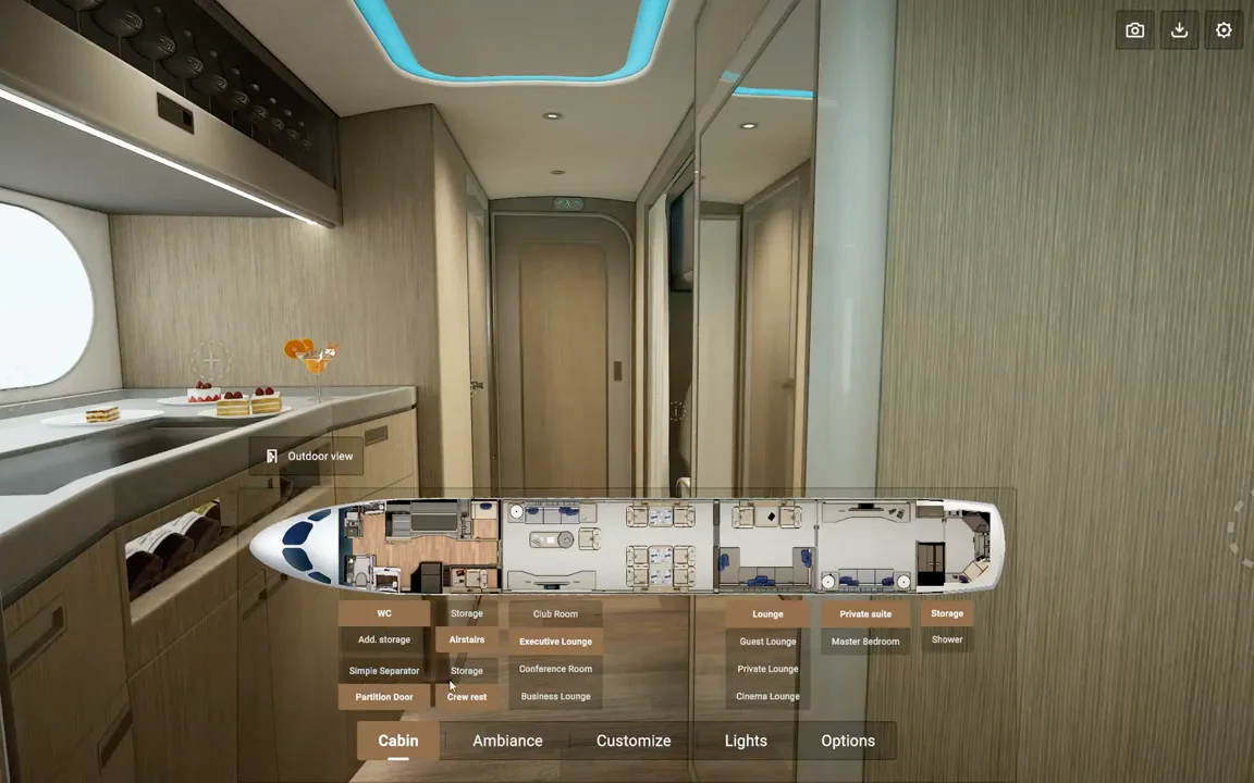
This floorplan replaced the sidebar or dropdown that would normally handle navigation. It kept the spatial logic intact: you're moving through an aircraft, not picking from a list of rooms.
Materials with real-time feedback, at scale
Every surface, floor, ceiling valance, window shades, wood veneer, paint, curtains, pulled swatches directly from the manufacturer's real material library. Selecting one updated the 3D environment instantly.
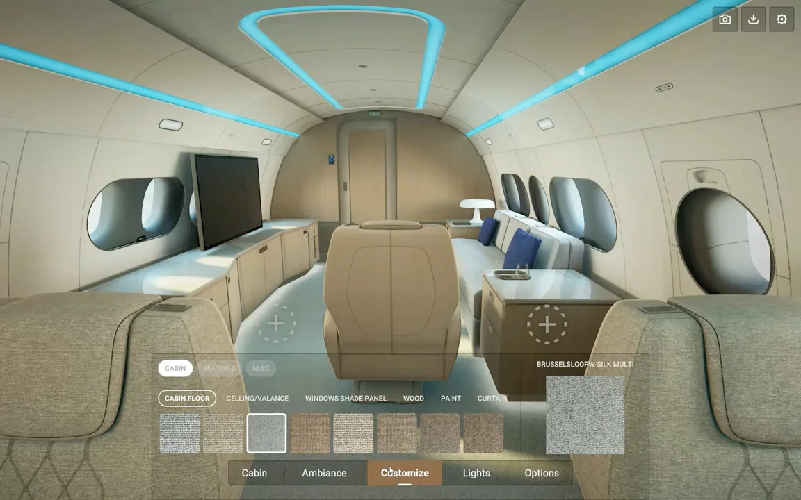
One detail mattered more than it should have: a fabric that reads warm on a 2cm swatch reads completely differently stretched across twenty seats. Every preview showed the material in context, at scale, never as an isolated chip.
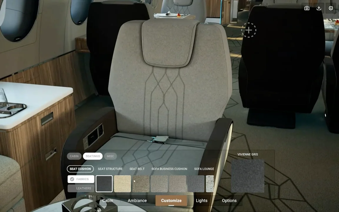
Lighting as configuration, not decoration
Ceiling, valance, and partition lighting were each independently adjustable, with preset moods mapped to real use cases: Onboarding, Work, Relax, Sleep. This wasn't cosmetic. A dark upholstery choice that looks right under warm daylight can look wrong entirely under a cool blue sleep setting, and a client committing to that choice needed to see it under every condition before deciding.
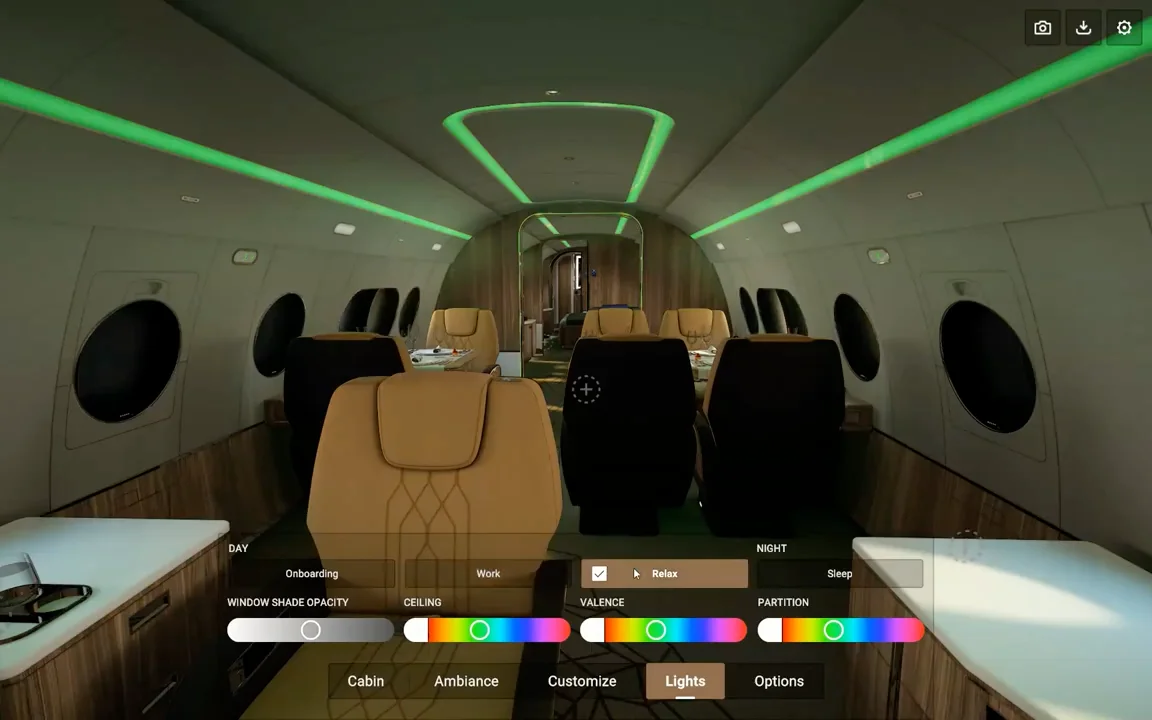
Some clients ended up configuring lighting first and working backward to materials. That wasn't planned, but it confirmed the lighting layer needed to be a first-class part of the configurator, not an afterthought.
iPad: designing for a table, not a lap
The iPad version lived in one-on-one sales meetings, the device sitting between salesperson and client. That context changed the interface entirely. Controls had to read correctly from two directions at once, the client facing the screen straight on, the salesperson reading it upside down from across the table, so nothing could depend on a fixed orientation. Every material swap and lighting change had to feel instantaneous; in a face-to-face meeting, latency reads as awkwardness, not as a technical limitation.
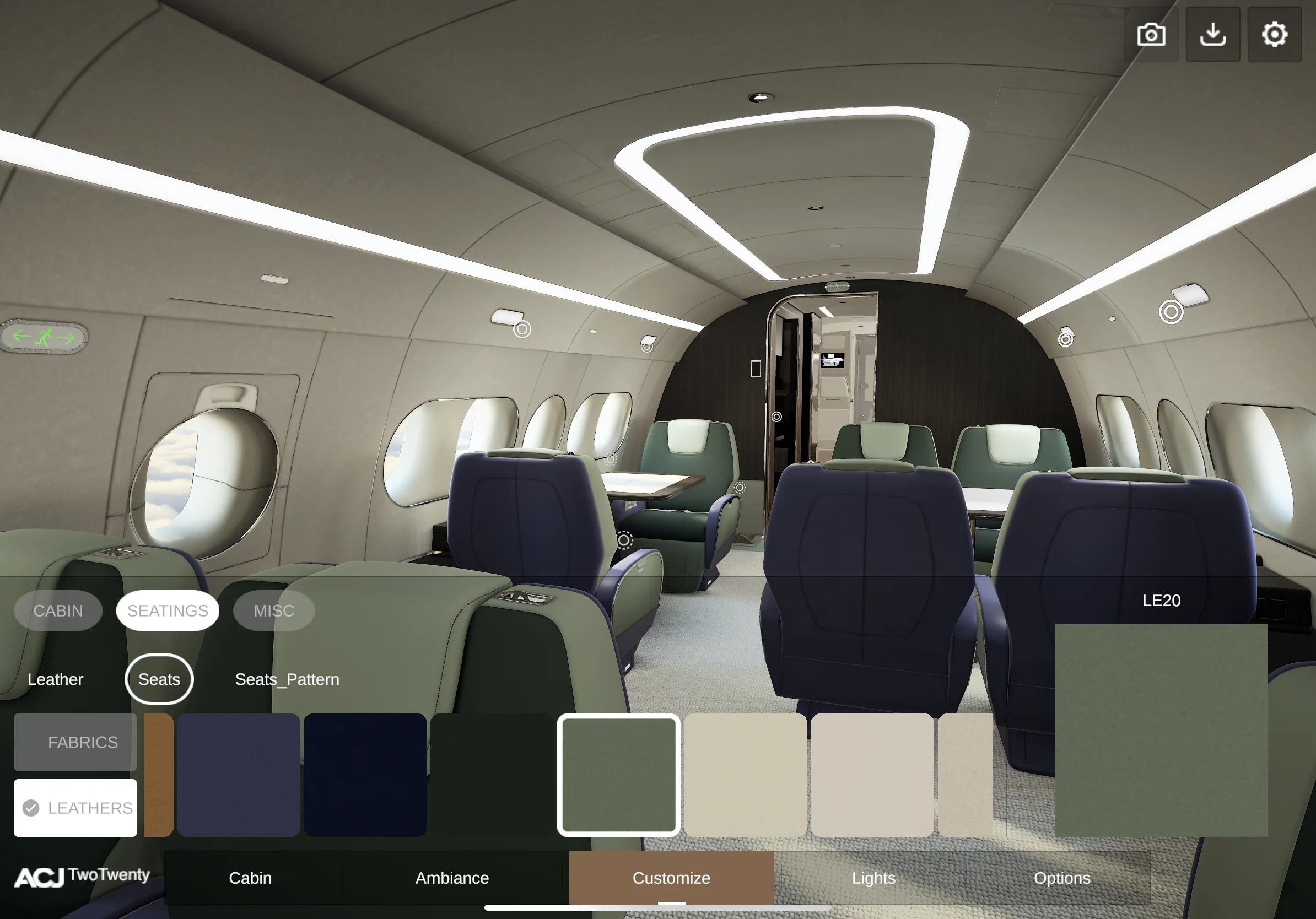
A presentation mode let the salesperson drive with curated camera positions and triggered annotations, while still letting the client take over and explore freely at any point.
RFID material cards: extending the demo beyond the device
The configurator could read real material samples through RFID tags, tap a physical swatch, see it load into the 3D scene. But actual samples aren't always on hand at a trade show or a remote pitch. I designed a full set of RFID material cards in Figma, each reproducing the material visually and embedded with a chip, so any salesperson could run the full tactile demo anywhere, without needing the physical library present.
What multi-platform XR actually requires
The difficulty isn't technical complexity, it's that every design decision needs three separate answers. A hover state that works with a mouse has no equivalent on iPad. Locomotion that feels natural in a headset breaks down on a touchscreen. What worked was treating each platform as its own interaction model while keeping the visual language and the underlying configuration data unified across all three; same cabin, same materials, same lighting options, different way of moving through them.
The other lesson: when the product costs what a private jet cabin costs, the configurator is part of the product. Getting the experience wrong doesn't just mean a clunky app. It means a deal that doesn't close.