A client walks into a boutique, sees a screen running a configurator they've never touched before, and has to start exploring watch models and materials within a minute, with zero instructions. That was the constraint on this project at an XR agency in Paris: a configurator for a luxury watch brand, spanning multiple collections, running on iPad for touch and on a large screen with Ultraleap hand tracking for a touchless, theatrical version. My role covered UI design and the 3D interaction state machine driving both.
The problem: zero training, two input methods
Touch and hand tracking don't share an interaction vocabulary. A pinch-to-zoom gesture on iPad has no natural equivalent in mid-air. But the product and the decision-making process had to feel identical across both, and neither could ask the user to learn anything first.
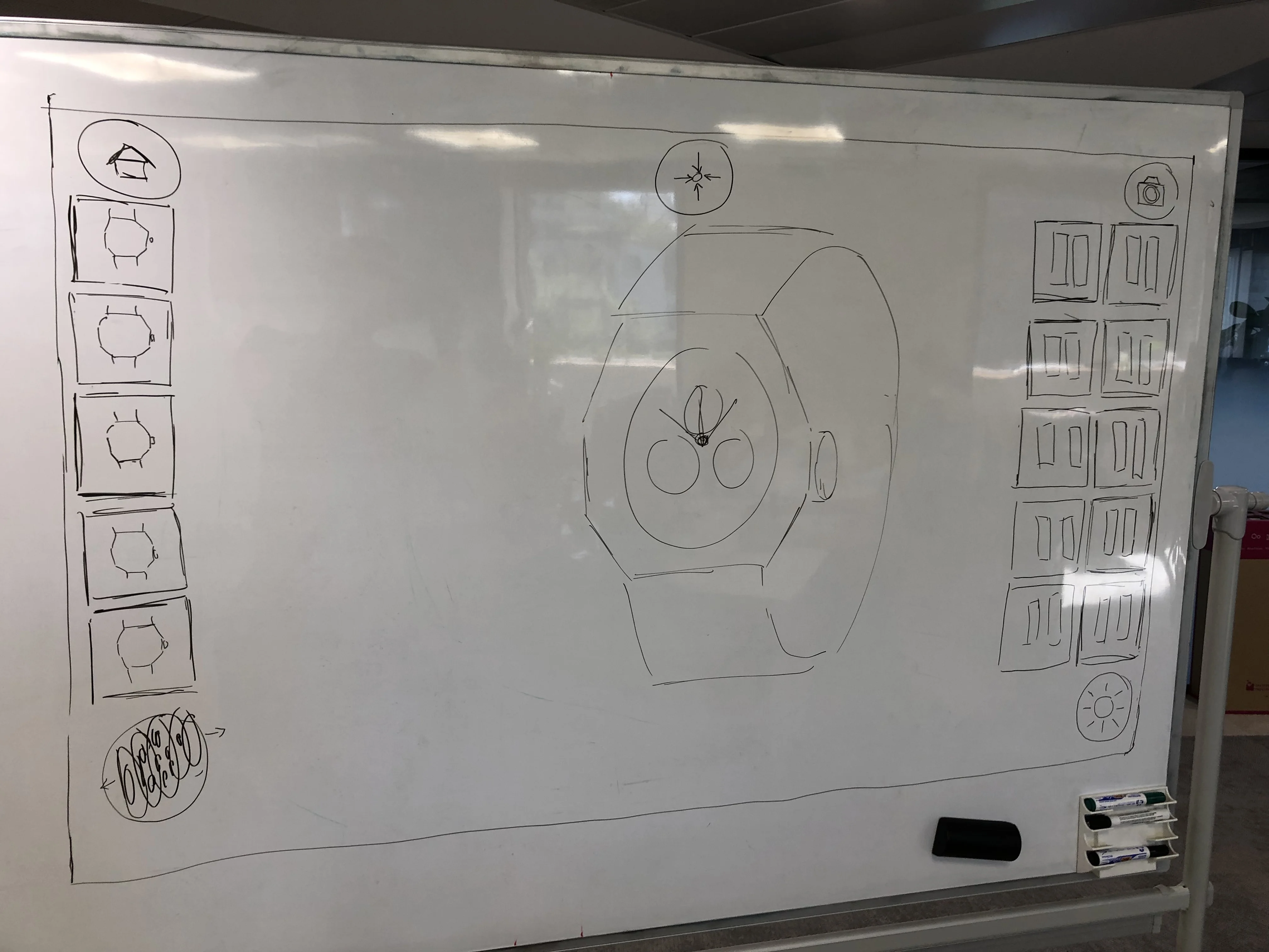
I started by mapping how clients already behave with a physical watch: pick it up, turn it under light, flip it to see the caseback, ask about options. The interface needed to replicate that instinct, not introduce a new one.
A state machine built around physical behavior
The interaction logic centered on a small set of discrete modes: Orbit for free 360° rotation, Fit for framing a specific part like the dial or bracelet, and Light for adjusting virtual lighting to check how materials read. Every transition between modes had to be reversible with a single, consistent gesture, and no modal ever trapped the user in a submenu; customization stayed contextual and accessible from the main view at all times.
On iPad, a one-finger drag rotated the watch, pinch zoomed, tapping a strap option updated the model instantly. The hand-tracking version mirrored the same logic through hover and pinch gestures, with the cursor appearing only when needed to keep visual noise down.
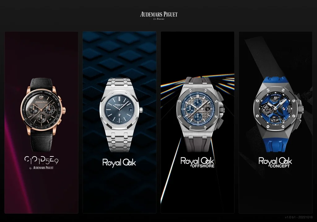
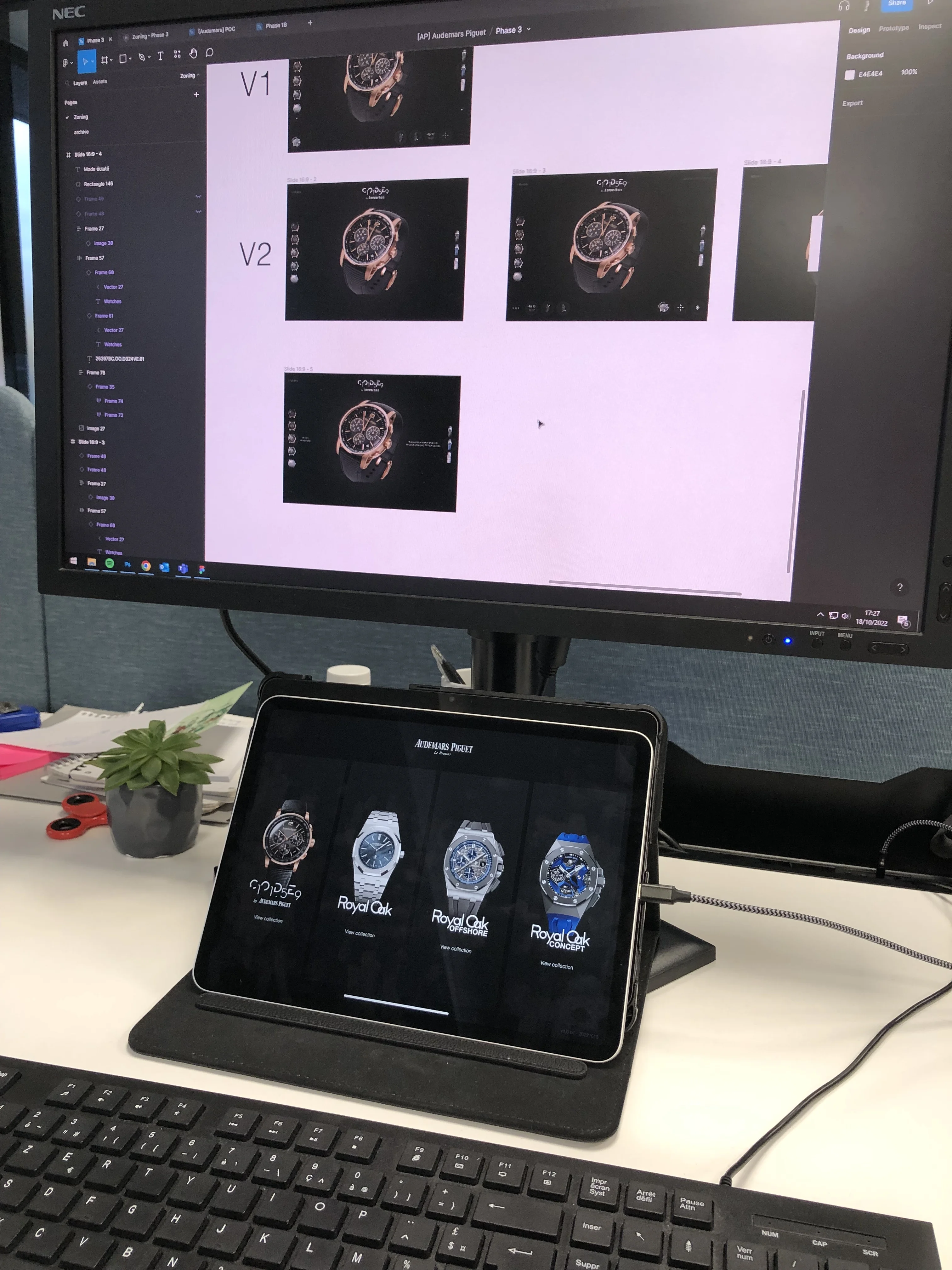
Collection selection relied on large thumbnails and visual recognition rather than text-heavy menus, each responding to hover or touch with a subtle scale animation that gave feedback without breaking the aesthetic.
Close-up inspection without breaking scale
Clients wanted to examine the dial, hands, and indexes closely. I introduced a focused mode that framed the watch tightly and allowed micro-adjustments through small gestures, with the state machine explicitly tracking whether the user was in global orbit or localized inspection to prevent accidental jumps between the two scales.
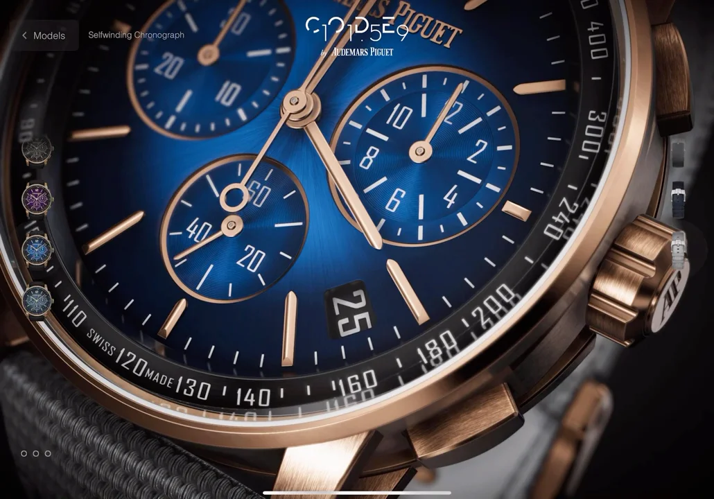
Interface elements faded in only when a hand or finger approached the edge of the screen. For the touchless version specifically, this proximity-based reveal mattered: without it, gestures near the watch itself triggered accidental activations.
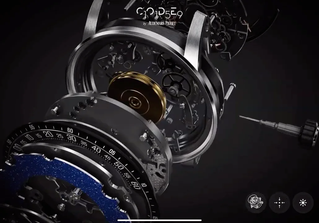
An exploded movement view let clients see the internal mechanism, separating case, dial, and movement spatially while keeping them visually connected. I limited the visible controls here to three persistent buttons, orbit, fit, light, because every additional option raised the cognitive load in a mode meant to feel effortless.
What testing on the real hand-tracking rig changed
Design decisions that looked correct in Figma didn't always survive contact with real hand tracking. I initially placed menu items too close to the center of the screen; in the touchless version this caused frequent mis-triggers, since users naturally gestured near the watch itself while examining it. Moving controls to the edges fixed it.
What zero-training luxury interfaces require
Three things held across the whole project. The interface has to disappear: in a luxury context, quality is judged by what you don't see, and every element that isn't the product itself has to justify its existence. State machines should mirror physical behavior rather than software convention, since anchoring digital states in how someone already handles a real object flattens the learning curve without a single tutorial. And feedback has to be subtle but immediate, especially with hand tracking where there's no tactile confirmation at all; micro-animations and edge glows confirmed a gesture was recognized without breaking the premium feel.
The final system ran four collections and dozens of models with consistent performance on both iPad and the Ultraleap setup, and clients moved from browsing to detailed customization without a single moment of confusion or guidance needed.