Sales reps for a major tire manufacturer were pitching fleet managers and dealers from printed spec sheets. A tire isn't just rubber and tread; it's a combination of size, performance rating, wear characteristics, and price that's genuinely hard to communicate on paper. I designed the iPad interface for an AR proof-of-concept built to close that gap at an XR agency in Paris.
The constraint: the interface can't be the focus
A sales rep cannot stare at a screen while making a pitch. That single fact shaped almost every decision. The app placed a 3D tire model in the room using the iPad camera, with a live AR view on the left and a configuration panel on the right for tire family, size, and sidewall markings.
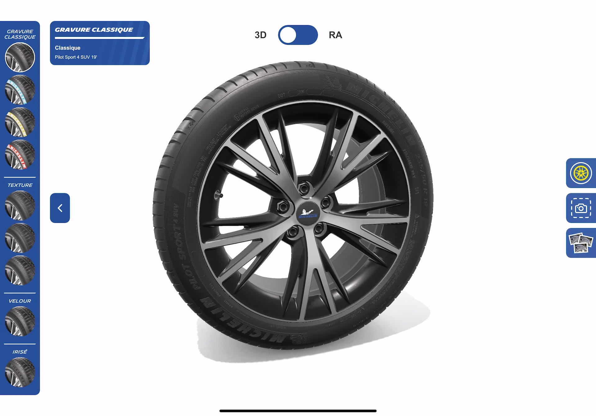
I kept the configuration panel collapsible with large, thumb-friendly buttons, and limited the number of visible options at any moment. Status information like current size and price stayed in a compact header, visible even with the panel minimized, so the tool never demanded more attention than the conversation itself.
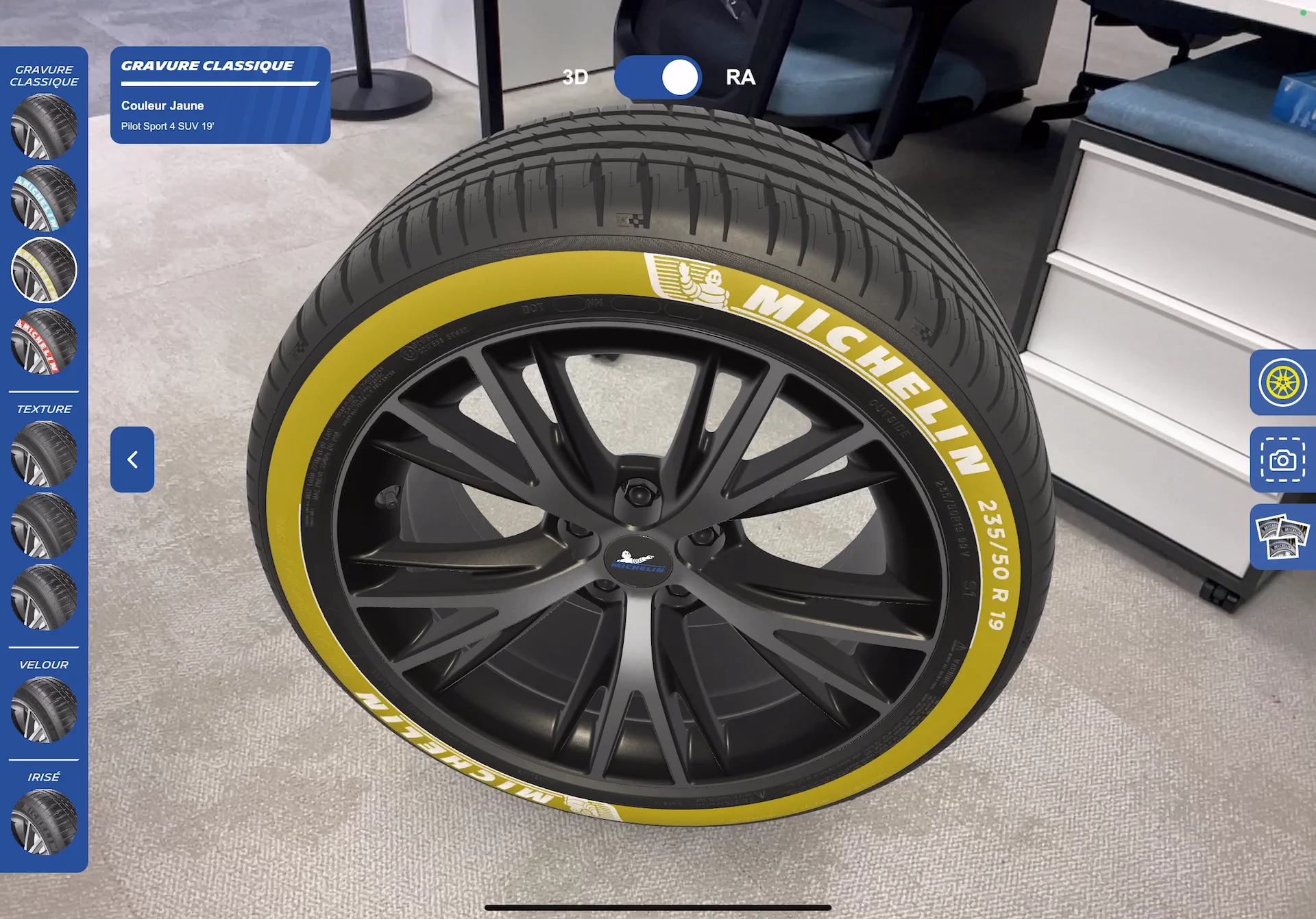
I also chose to show one tire at a time rather than a full vehicle. That simplified the interaction and kept the focus on the actual product, while AR placement at real scale still let prospects picture it next to their own trucks or cars.
What internal testing actually surfaced
Sales reps consistently asked for larger text, fewer nested menus, and an obvious way to reset the AR session when tracking drifted. None of that was an aesthetic preference; it came directly from watching people try to use the tool mid-pitch. Those requests shaped the final layout more than any visual direction I'd started with.
The POC also had real limits. AR placement looked convincing under controlled lighting, but variable outdoor conditions occasionally caused the model to jitter or float. I documented those cases rather than hiding them; the goal was demonstrating potential, not pretending the tool was production-ready.
What this confirmed about sales tools specifically
The interface has to support the conversation, not become it. Every element was judged on how little attention it demanded from the person speaking. Progressive disclosure beats showing every option at once; twenty tire variants displayed simultaneously creates decision paralysis, so advanced filters stayed hidden until needed. And reliability matters more than visual polish for this category of tool specifically; a stable, slightly less flashy experience earns more trust than one that looks impressive and occasionally breaks.
Reps who tested the prototype reported feeling more confident presenting technical differences when they could show rather than describe them, and fleet managers responded well to seeing accurate scale and markings in their own environment. The real value wasn't the 3D model itself. It was the shared understanding it created between seller and buyer, which only works if the interface stays out of the way.